12 Types of Dark Patterns That Trick You Online
Dark Patterns: a user interface that has been carefully crafted to trick users into doing things, such as buying insurance with their purchase or signing up for recurring bills.
You’ve probably encountered loads of types of dark patterns during your time on the internet, you just didn’t realise it.
Most likely because they’re designed to be deceptive, and quietly manipulate you into doing something you don’t want to do.
There are plenty of ways that companies do this, 12 to be exact, and none of them has your best interests at heart.
It could be as simple as signing up to an e-mail list.
Or, you could sign away personal data that gets used against you when you try to purchase insurance in the future.
It doesn’t sound fair, does it?
I’m sure you agree that design should be transparent and user-friendly.
Unfortunately, companies trying to make a quick buck off you don’t care about any of that.
Luckily, we’ve compiled a list of 12 types of dark patterns so that you’re able to recognise them online.
Types of Dark Patterns:
Bait and Switch
This is where you set out to do one thing, but a different, undesirable thing happens instead.
You might remember back in 2016 when Microsoft tried to get everyone to upgrade to Windows 10.
Eventually, through incessant pop-ups, most people began to accept it.
As time went on, Microsoft eventually resorted to a tactic that had many users up in arms.
Since the 80s, the little X in the top-right corner was used to close the window.
However, they decided to replace the X to instead mean:
“yes, I want to upgrade my computer to Windows 10”.
It sounds too ridiculous to be true, doesn’t it?
Eventually, Microsoft changed it back to normal -but not until an angry crowd of pitchfork-wielding users threw them under the bus!
Confirm shaming
Confirm shaming guilts the user into opting into something by shaming them if they decline.
The most common example of this is when sites get you to sign up to their mailing list.
For example, here’s one on a financial website offering investment reports in exchange for your email address.
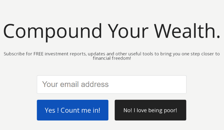
The sign-up gives you two options. “Yes! Count me In!” or “No I love being poor.”
Once you start noticing this dark pattern it turns up all over the place.
Whether you’re on Amazon, the high street, or using an ATM – you’re going to encounter this type of dark pattern everywhere.
Oh, and also, it’s probably partly to blame for you having 58,394 unread e-mails in your inbox!
Disguised Ads
This is where adverts are disguised as other kinds of content or navigation, in order to get you to click on them.
I know I’ve said it a lot, but this one really is everywhere. Noticing a (dark) pattern emerging?
It’s 2019, you’ve probably watched enough films online that you’d feel at home on Blackbeard’s ship.
How many times have you seen a big flashing button that says “DOWNLOAD IN HD”, right next to another 3 links saying the exact same thing?
One link takes you to a survey page, another to a pop-up ridden website, and the link to actually download it is probably a small line of writing so small it could fit inside a comma.
Okay, that might be a bit of an exaggeration but you get the idea.
Forced Continuity
You know when your free trial comes to an end and your account starts getting charged without any warning?
That’s forced continuity.
“If I had a dollar for every free trial I’ve let renew after the first month, I’d probably be bankrupt due to all of the subscriptions I forgot to cancel” – Confucius, probably
These companies not only aren’t reminding you that your trial is ending but trying to cancel it is usually extremely complicated.
This dark pattern is used commonly with disguised ads.
They promise you money off your order if you click this link and in return, you’re suddenly enrolled on a $30/m subscription to a service you’ve never heard of.
How nice of them!
Friend Spam
Some products ask for your email, or social media permissions, promising some kind of benefit.
It’ll then spam all of your contacts in a message claiming to be from you.
The dangerous part of this is that there’s no way of knowing what they’re going to send to people – it could end up being quite dangerous.
It isn’t as common with major websites anymore but is used frequently by app creators to get more downloads.
A lot of people, myself included, quickly skip through the permissions pages when downloading a game.
These permissions are abused, and the game or app will post on your social media and message friends without asking you first.
A popular example of this, which resulted in a multi-million dollar lawsuit, was LinkedIn back in 2015.
They encouraged you to give them access to your e-mail account when signing up.
This was on the premise that you could build up a strong network for your career. Something that sounds super enticing to a new user trying to build relationships.
It sounds harmless, right?
But, in actuality, those who went along with it inadvertently gave LinkedIn permission to spam every single person you’ve ever e-mailed.
Ever.
Unsurprisingly, this turned out to be illegal and ended with the company having to pay out over $13 million in claims to those affected.
Hidden Costs
You get to the last step of the checkout process, only to discover some unexpected charges have appeared.
This is a personal pet peeve of mine.
I just want to buy a music ticket, Ticketmaster, why is there an extortionate booking fee? Also, what’s the deal with a service charge for ordering things online? It just doesn’t make any sense.
Check out this example from ProFlowers, a flower retailer based in the US, demonstrating dark patterns perfectly.
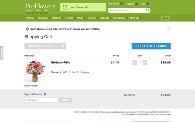
When you go to purchase some flowers, everything seems to be in order.
All you need to do is head through the checkout process and you’ll be blessed with some beautiful flowers in no time at all. Right?
Er, no.
Once you make it to the final screen – after a very lengthy process – you’re suddenly greeted by extra costs that weren’t advertised at all.
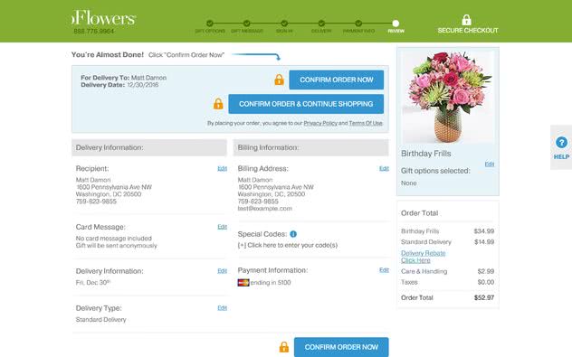
Now you have to pay almost 50% more for delivery, as well as a care and handling fee. What in the world is a care and handling fee, anyway?
Misdirection
Misdirection, as the name suggests, is where a design purposefully focuses your attention on one thing in order to distract you from another.
Way back when I was less internet savvy, the number of extra programs I installed by blindly clicking through installations was ridiculous.
I recently tried to install BitTorrent.
Along the way, I had to expertly navigate my way through a maze of menus and checkboxes to stop any third-party programs getting installed.
They warned me that my download speeds would be painfully slow if I declined to install the Opera browser.
If you’ve ever wondered where that random extension on your browser came from, you probably clicked too fast to get something installed.
Another popular approach is to trick you into paying extra for a service, that you really don’t need to pay for.
This is incredibly popular with airlines. They set up their site in a way that makes it seem like you have to pay money to book a seat.
In actuality, if you just skip the process they’ll still give you a seat on the plane for free.
They try really hard to not make this obvious.
Price Comparison Prevention
The retailer makes it hard for you to compare the price of an item with another item, so you cannot make an informed decision.
Does a website really need this many subscriptions?
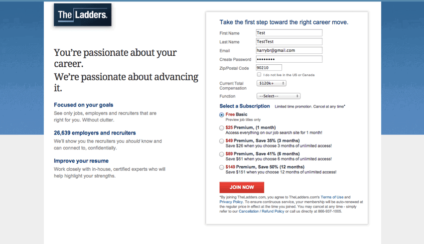
As it turns out, free users are able to search for jobs on the website. But, if you want to apply you’re going to have to choose a subscription option.
All of a sudden it doesn’t seem like they’re as passionate about your career as they make out to be.
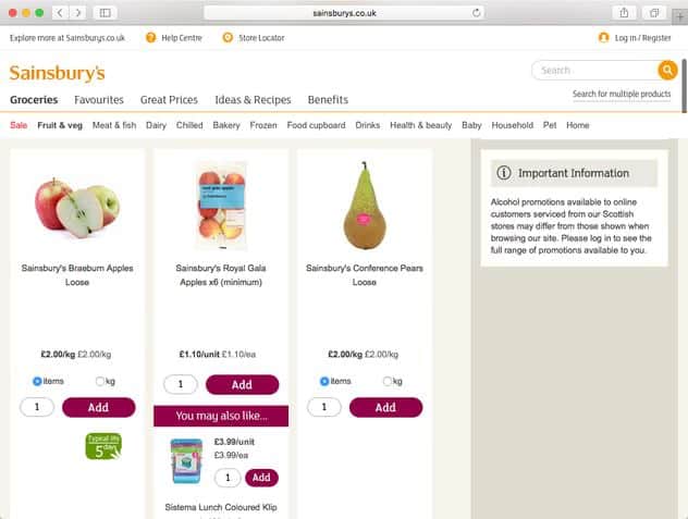
Also, check out this example from the popular supermarket Sainsbury’s.
They change the way that prices are displayed, whether it’s by weight or by volume. Making it incredibly hard for you to decide which option is the best value.
Privacy Zuckering
You are tricked into publicly sharing more information about yourself than you really intended to.
Named after none other than the king of data himself, Mark Zuckerberg, this dark pattern is used in nearly every corner of the internet.
Usually disguised within the small print of the Terms and Conditions, it gives the company the right to sell your personal data to third-party companies.
It’s not just personal information such as your age or your e-mail, it couldn’t contain details of your sexual preferences, and even your mental and physical health.
This could eventually lead to you being refused insurance or loans in the future.
It’s all very legal, and very disturbing.
Since data is a $200 billion industry, I wouldn’t expect this dark pattern to phase out any time soon.
Just try to be mindful of what you’re sharing online.
Also, check out stopdatamining.me to see how ridiculously difficult it is for you to opt-out of every companies data policy.
And yes, it’s next to impossible to delete your data entirely.
Roach Motel
This is where the design makes it very easy for you to get into a certain situation, but makes it hard for you to get out of it.
Common with subscriptions, it’s easy to sign up to something and then frustratingly difficult to cancel.
A few examples include:
- Spotify having you press cancel 4 separate times just to be able to get away from them.
- The Boston Globe making you go to their FAQ section, and then phone them up directly in order to cancel.
- Ticketmaster signing you up to Rolling Stone Magazine, only to make you post them a cancellation within 30 days (more on this later).
It’s all just a competition to try and add in as many steps as possible since you’re less likely to go through with it if it takes you ages to cancel.
Sneak into Basket
You attempt to purchase something and, somewhere along the purchasing journey, the site sneaks an additional item into your basket.
Often through the use of an opt-out radio button or checkbox on a prior page.
I’m spoiled for choice on this one.
Our old friend Ticketmaster seems to think that everyone wants a subscription to Rolling Stone Magazine, and through the use of an opt-out checkbox on the order page, it’s more than likely a lot of people have signed up.
Oh, and if you want to cancel it, you’re going to have to print out the form, fill it in by hand and mail it with a stamp within 30 days.
Another great example is GoDaddy, the popular domain hosting service.
Search for a name you want to buy, and it flashes up saying “ONLY $0.99 for the first year”.
Let’s say you buy a few of these, and you’re expecting to pay around $17.
Now, when you go through to the checkout page it’s suddenly at $150?
OH, that’s right, you wanted 2 years instead of 1, as well as privacy protection on all domains.
But, we didn’t ask you, we just assumed. That’s cool, right?
Just a quick note, it’s now illegal to sell privacy protection in the UK and some EU countries, so if you are looking for a domain, don’t fall victim to this.
Trick Questions
You respond to a question, which, when glanced upon quickly appears to ask one thing, but if read carefully, asks another thing entirely.
Do you know those checkboxes that require a PhD in Quantum Physics to decipher due to how many double negatives they put in?
That’s a trick question.
Companies purposefully make these confusing, so that you’re more likely to sign up to whatever it is they’re offering.
Here’s a nice example from Currys, a leading electrical supplier in the UK.

You’re most likely going to tick the first box, and out of habit will probably tick the second box.
I hope you love third-party offers!
Protect Yourself from Dark Patterns
As always, thank you for reading. I hope this article has given you some insight into how companies are manipulating you online.
Whether they’re trying to take your money, your data, or even your social media accounts – they definitely know what they’re doing.
The crazy part is that it’s all completely legal.
It’s going to be a mainstay on the internet for a long time to come, especially as so much money is involved.
The best thing you can do is keep informed and up-to-date on dark patterns, and share this article to anyone you think will benefit.
